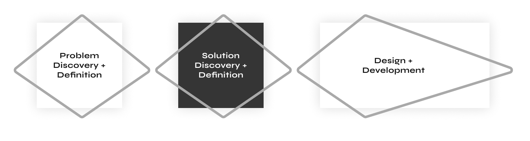
I helped a booming startup in the hotel industry switch to a mobile-first approach of their product. Check how hotels can make custom mobile apps for their guests.
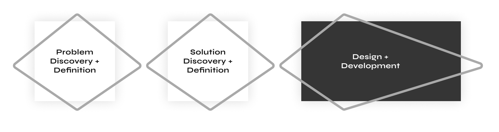
The challenge of this project was to find a unique angle for this portfolio builder. There are many website builders out there, so is the world waiting for another kind of website builder? Next to that, I led the whole research, design, and development process, so I was challenged to switch between keeping the overview and diving into the deepest details.
The project resulted in several outcomes. The intangible outcomes are the research findings and new knowledge gathered through several rounds of interviews and testing. Another intangible outcome is a new methodology for testing out hypotheses for future product development in the company. The tangible outcomes are several prototypes and a high-fidelity working MVP used by a selected group of potential users.
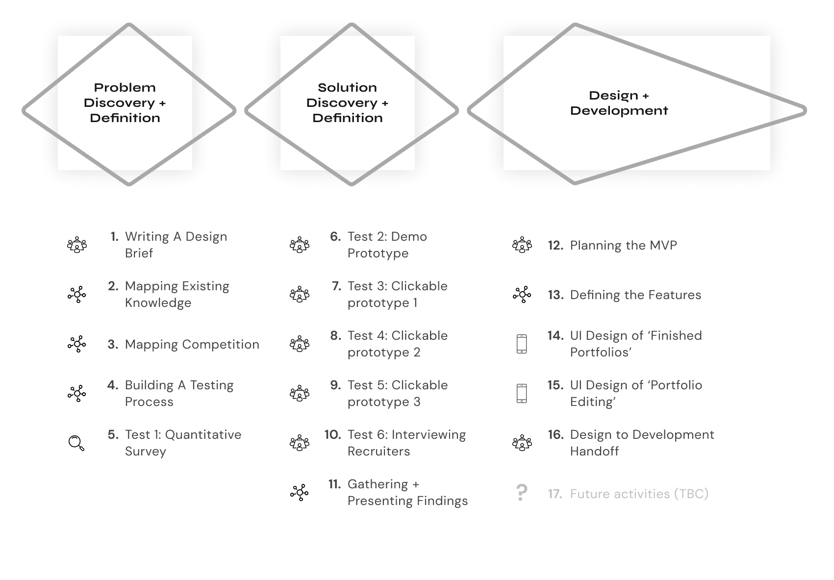
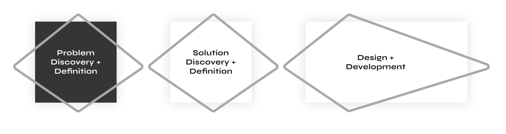
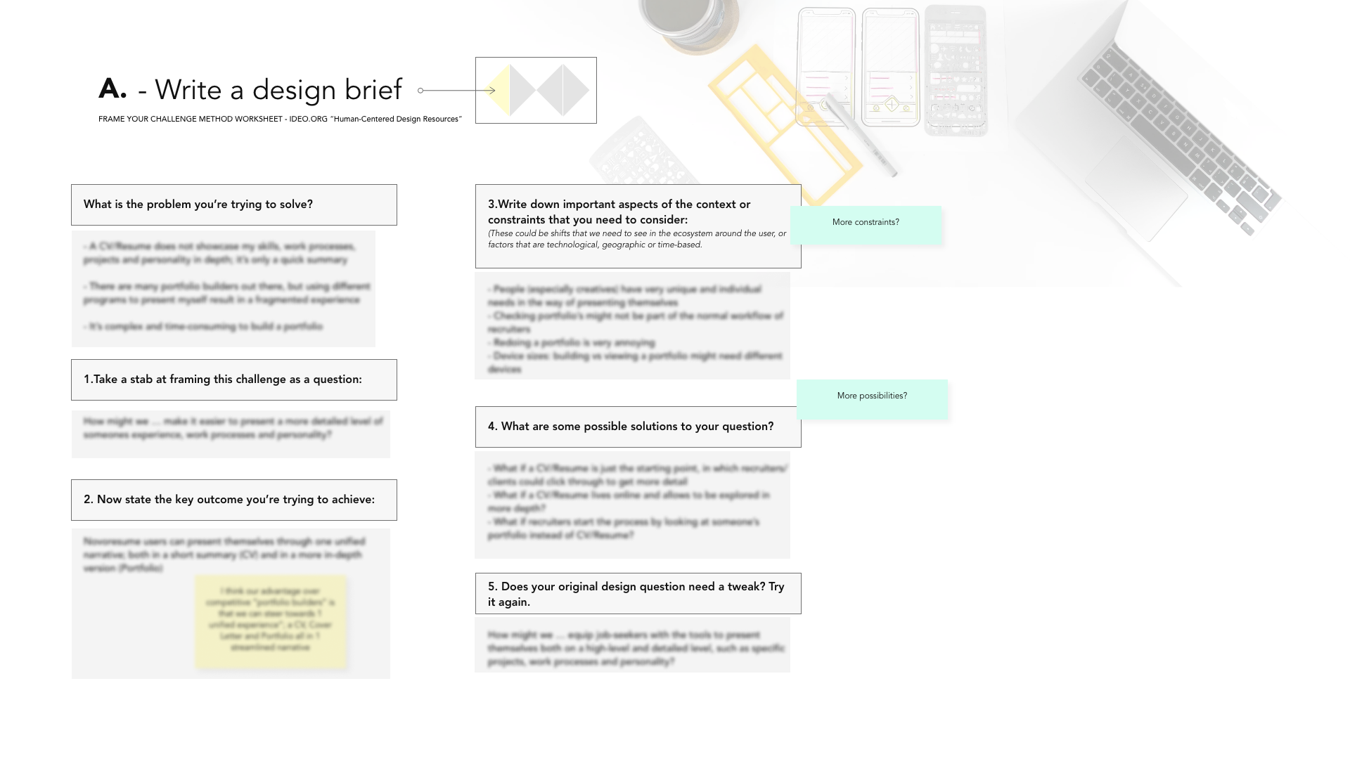
The first step of this project was to write a clear design brief to understand and frame the problem clearly. There are several ways to construct a design brief; for this project I used IDEO’s approach and answered a few of their key questions to explore the context of the project:
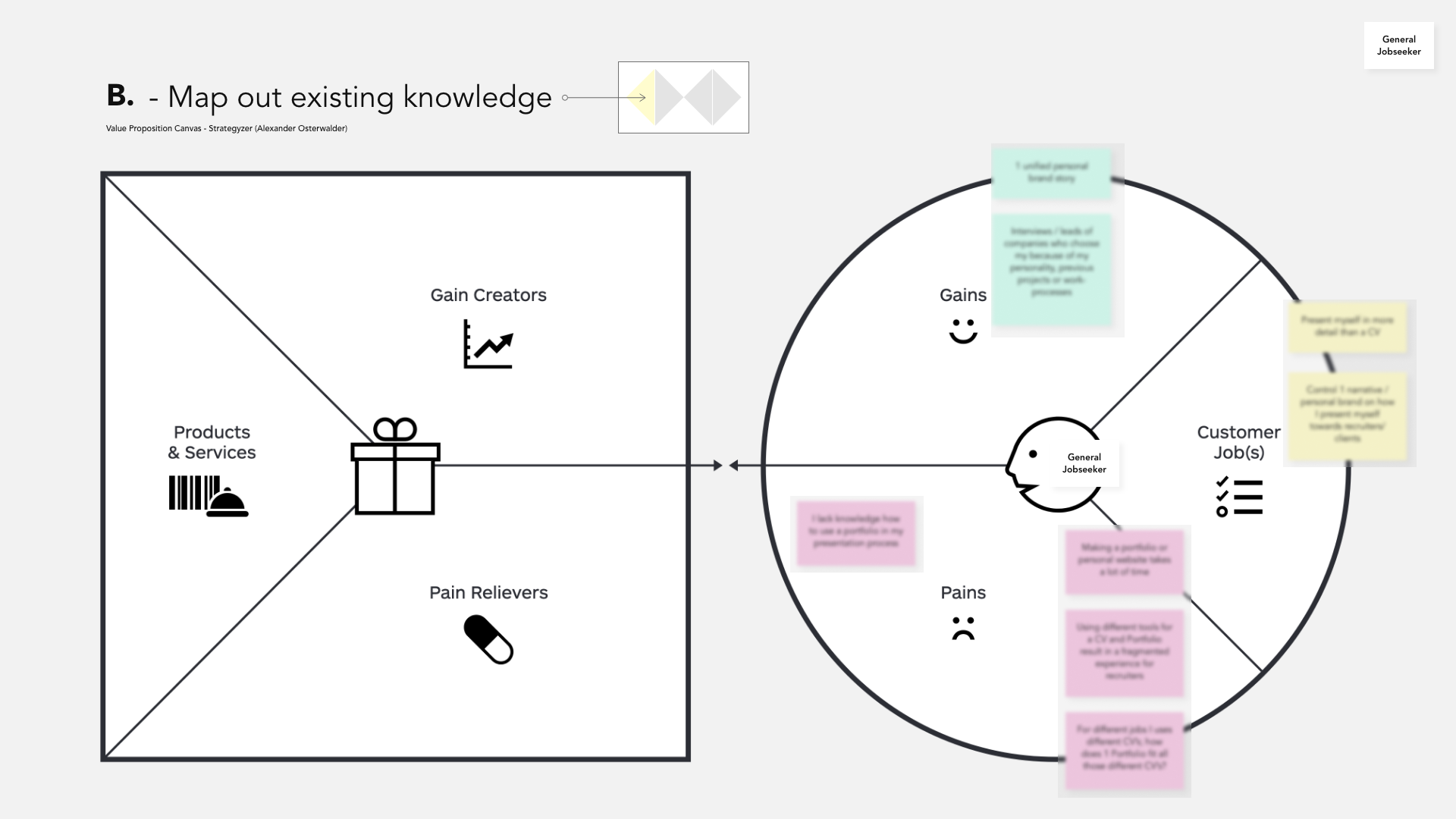
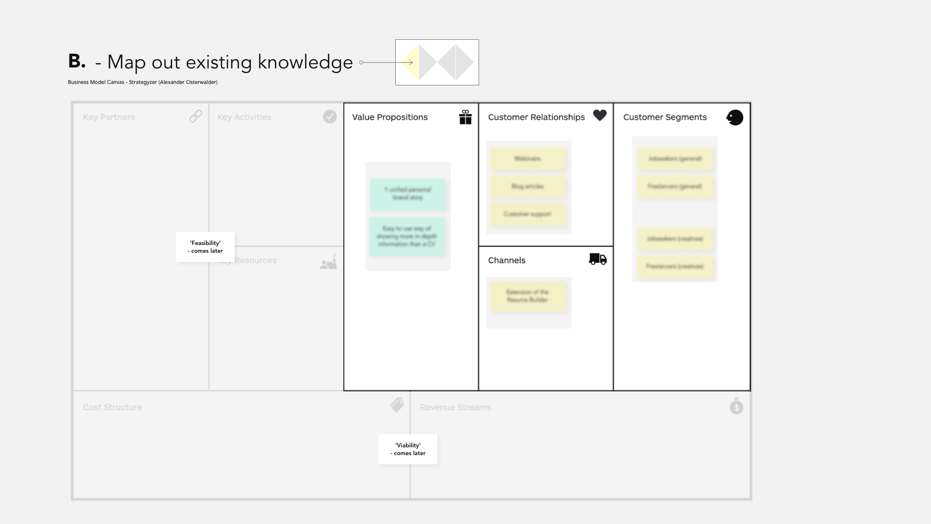
After defining the design brief, it was time to map out existing knowledge we already had in the context of portfolios and job-seeking. To map this out systematically, I used the Value Proposition and Business Model Canvas. As this was done before doing any research, these maps were filled in using the knowledge we have from our customers and our own experiences building a portfolio, so mainly assumptions that would need to be validated.
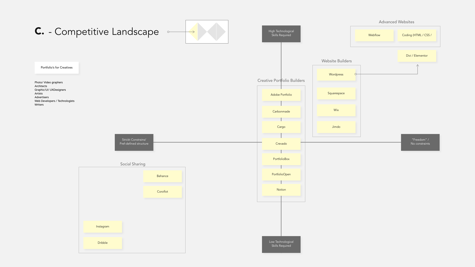
Following the mapping exercises, the next step was to analyze the competition. As there are many competitors in the field of portfolios and website builders, this exercise was focused on finding the different angles of the competition and explore what their main unique angles are. I did so by polarising the competition over two axes; level of technical skills required to make a website and level of pre-defined structure. This mapping resulted in the following overview.
After we explored the context, it was time to start testing our assumptions. Before diving in, it was essential to define the testing process as testing and analyzing outcomes can quickly become chaotic. ‘Hypothesis cards’ and dedicated tests to validate or invalidate our assumptions were used to plan the following testing steps.
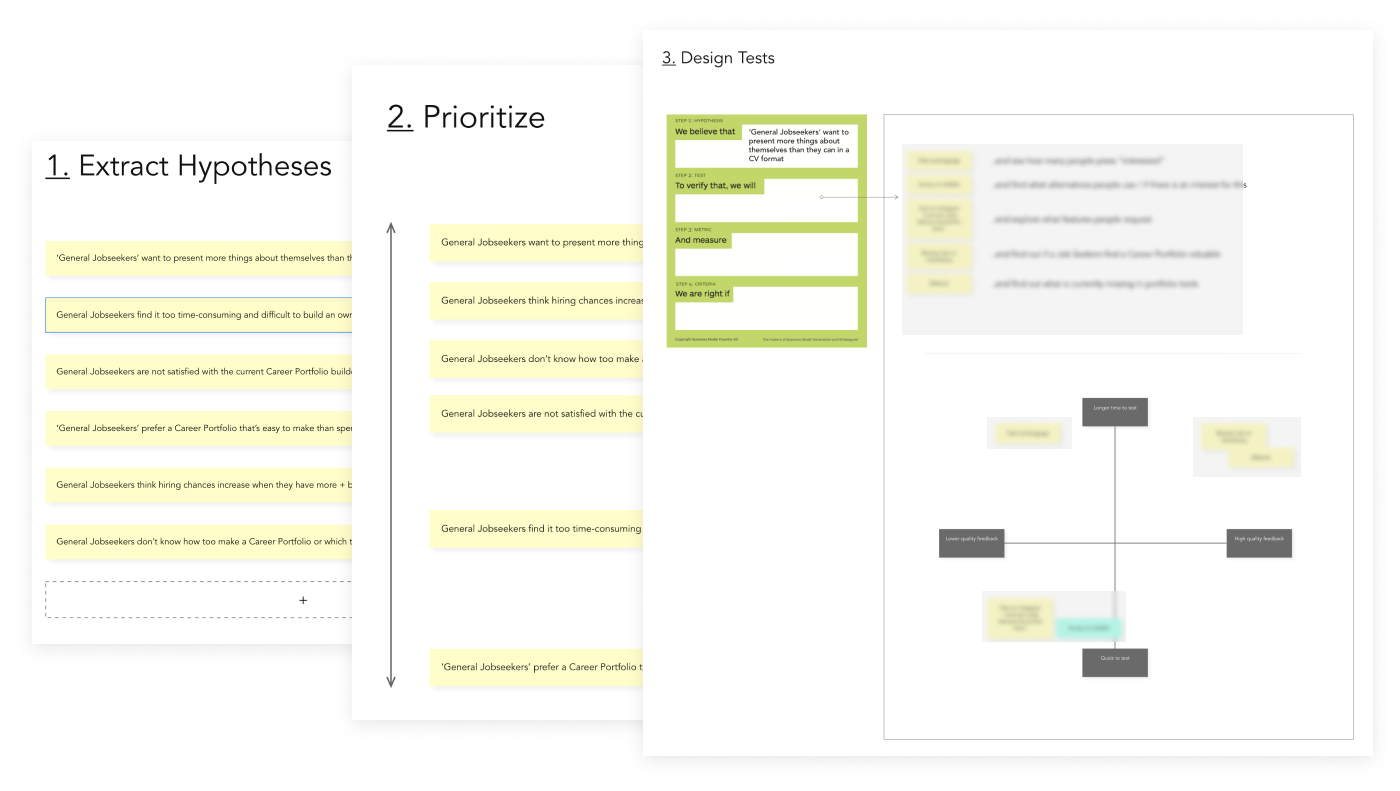
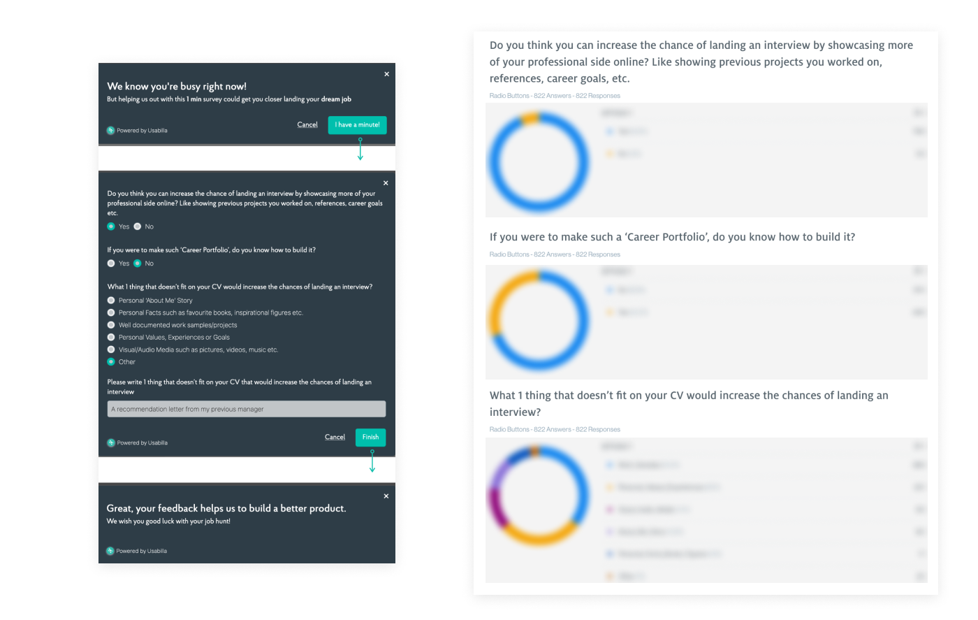
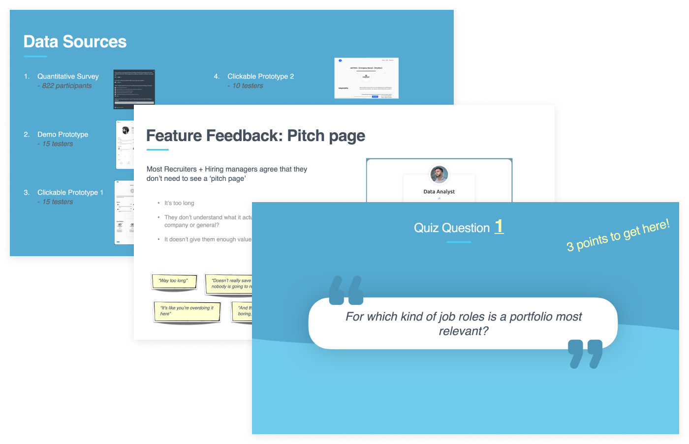
The first test was a quantitative survey among our users to determine if there is a general interest in a portfolio builder and what people would like to share with a potential recruiter/ employer that doesn’t fit or belong on a resume. 822 respondents filled in the survey, and the overall outcome was that the majority would benefit in their job search if they would have a portfolio showcasing their work and profile. We also learned what elements don’t fit on a resume, but job-seekers want to show this to recruiters. As it’s only a first test, we shouldn’t get ahead of ourselves, so more tests would be required to validate our hypotheses.
The second test was to show a small group of job-seekers an existing portfolio template and see what their reaction is. The portfolio was shown to 15 job-seekers through ‘Usertesting’ who shared their opinions and answered specific questions; If they think it would be easier to land a job with such a portfolio, if they know how to build something like this, if they ever tried to make a website etc. We learned that most job-seekers weren’t actively looking for a portfolio builder like this. Still, when shown a portfolio, they all reacted enthusiastically and wanted to have one for themselves.
The third test let a few job-seekers try out a low fidelity portfolio builder prototype, where they could click around and build a simple portfolio page by themselves. The goal was to let people try it out and experience how easy/difficult it is to make a portfolio. Again the prototype was tested by 15 job-seekers through ‘Usertesting.’ The findings were grouped into ‘ Value,’ ‘Look’s,’ ‘Content’ and ‘Usability.’
The fourth test was another low-fidelity clickable prototype focusing on a specific feature; a pitch page, where job-seekers could answer specific questions and pitch themselves to recruiters. 10 job-seekers tested this prototype through ‘Usertesting,’ and the reactions to this feature were not as enthusiastic as the previous ones. This is precisely why we test low-fidelity features early on, thereby saving time and development efforts later.
The fifth test was again a clickable prototype, but this was a bit higher fidelity and included some different features. 15 job-seekers tested the prototype through ‘Usertesting.’ The aim of this test was to understand what features they mainly liked, for which industries a portfolio would be most valuable, and more specific details about pricing.
The last but crucial test before gathering all findings was to understand the recruiters’ / hiring managers’ perspectives. To do so, I interviewed 6 recruiters / hiring managers from different industries. These conversations helped to uncover their needs, which can be seen as even more important than uncovering the needs of job-seekers; it’s more important for an application to show exactly the things a recruiter wants to see instead of things he/she wants to show him/herself. The prototype was also shown to the recruiters to see their reaction and dig deeper into which sections job-seekers should include and which to skip
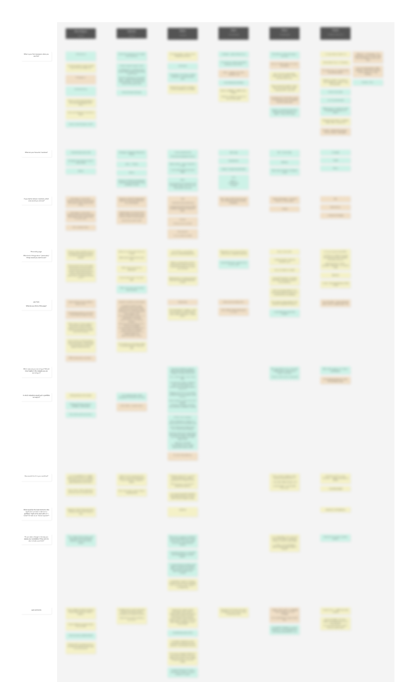
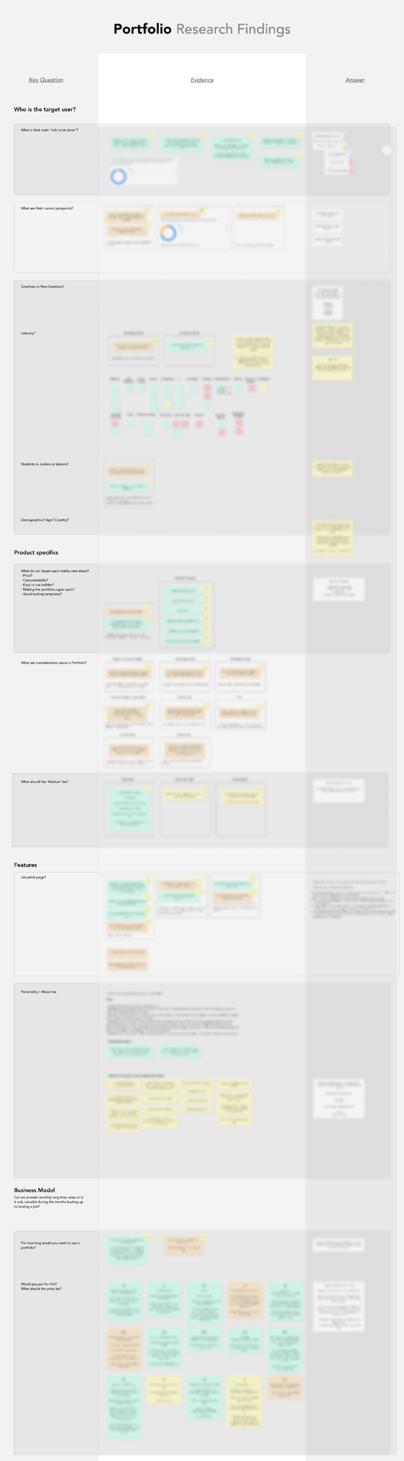
The last step in this phase was to gather, structure, and analyse the findings of all tests, and derive conclusions from them. Going over hundreds of quotes, I managed to find patterns and answer the main questions we outlined for ourselves at the start. The findings were presented to the rest of the team to find out whether they agree to continue with this project.
Presenting research findings is always a tricky activity, as it shouldn’t be an overwhelming amount of information but useful knowledge that sticks. In order to keep it engaging and the findings memorable, I presented the findings in the form of a ‘quiz.’ I asked a research question and let all team members write their answers on a post-it. After that, I would reveal the answer from the research and handed out a prize to the member with the most right answers. The conclusion of this first research phase was that we agreed to have found enough signs that there’s a need for our portfolio builder, so the project continued in the form of an MVP.
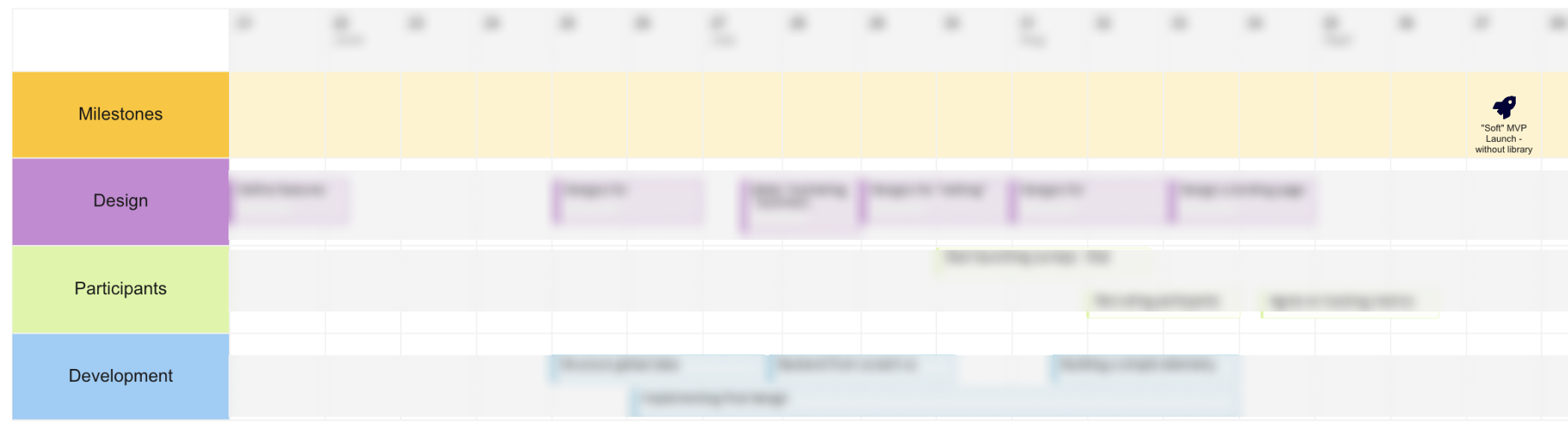
After the management gave the green light to proceed with the building and launching of an MVP, it was time to start the design and development process. I became the appointed product owner, responsible for making this project a success together with a developer and a colleague helping out with recruiting and testing. We’ve defined a roadmap with specific milestones about design and development deadlines with the three of us. From there, the tasks were divided in a Miro board and regular update meetings were scheduled.
From the extensive research (822 survey participants, 55 prototype testers, 6 interviewed recruiters) we were equipped with solid knowledge in order to start the design of this MVP. We knew precisely what recruiters want to see and what job-seekers want to show; now it was only a matter of materializing this knowledge in a tangible tool.
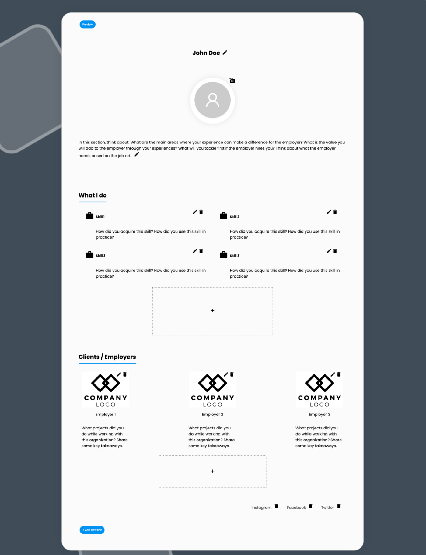
To learn quickly, we decided to launch a small version of the MVP first without cramping it full with interesting features. An MVP stands for a minimal viable product, so we had to focus on the core value. The MVP should enable job-seekers to show more about themselves than what fits/is expected on a resume; a deeper elaboration of one's personality, experience, and a showcase of previous projects.
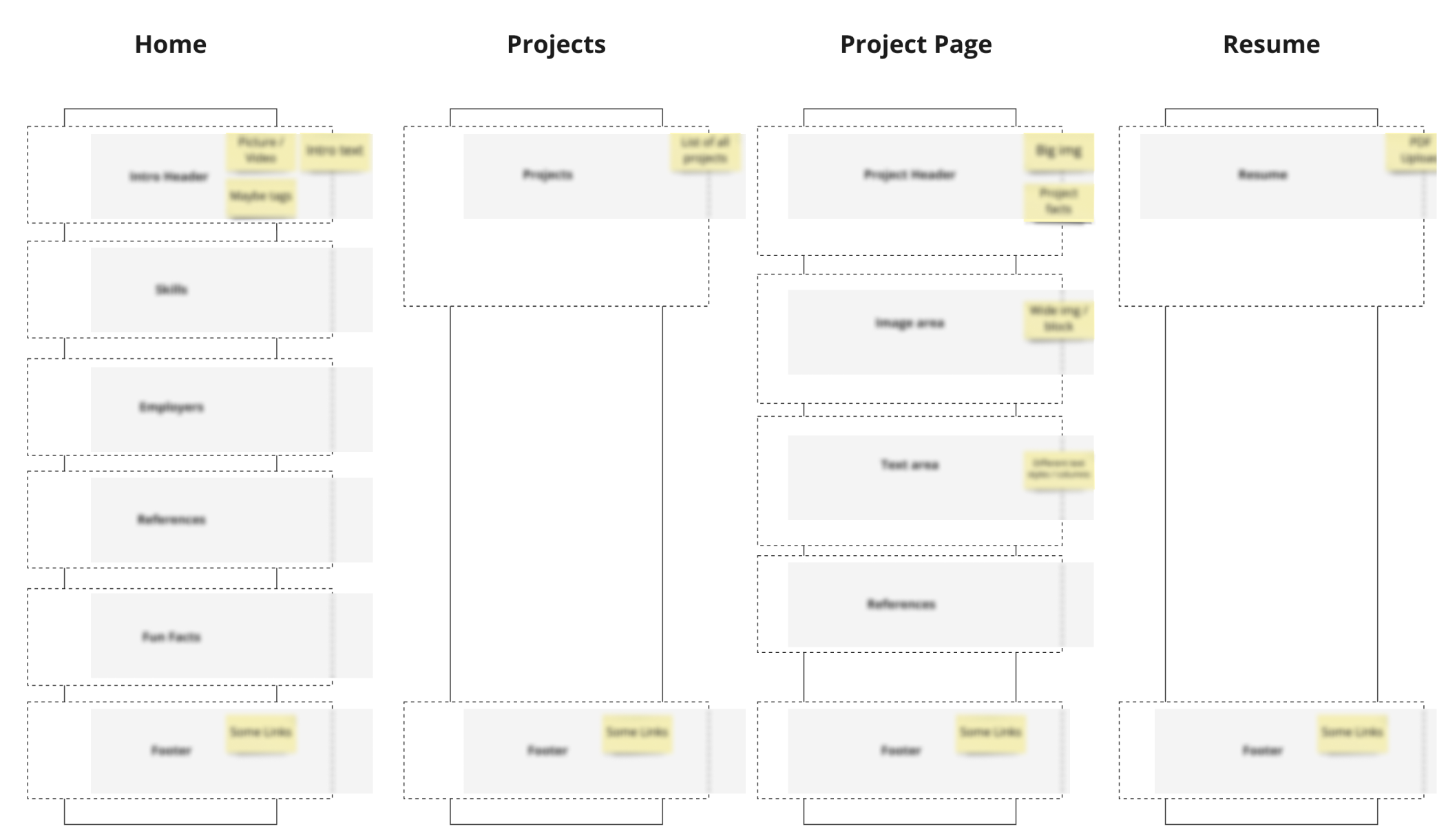
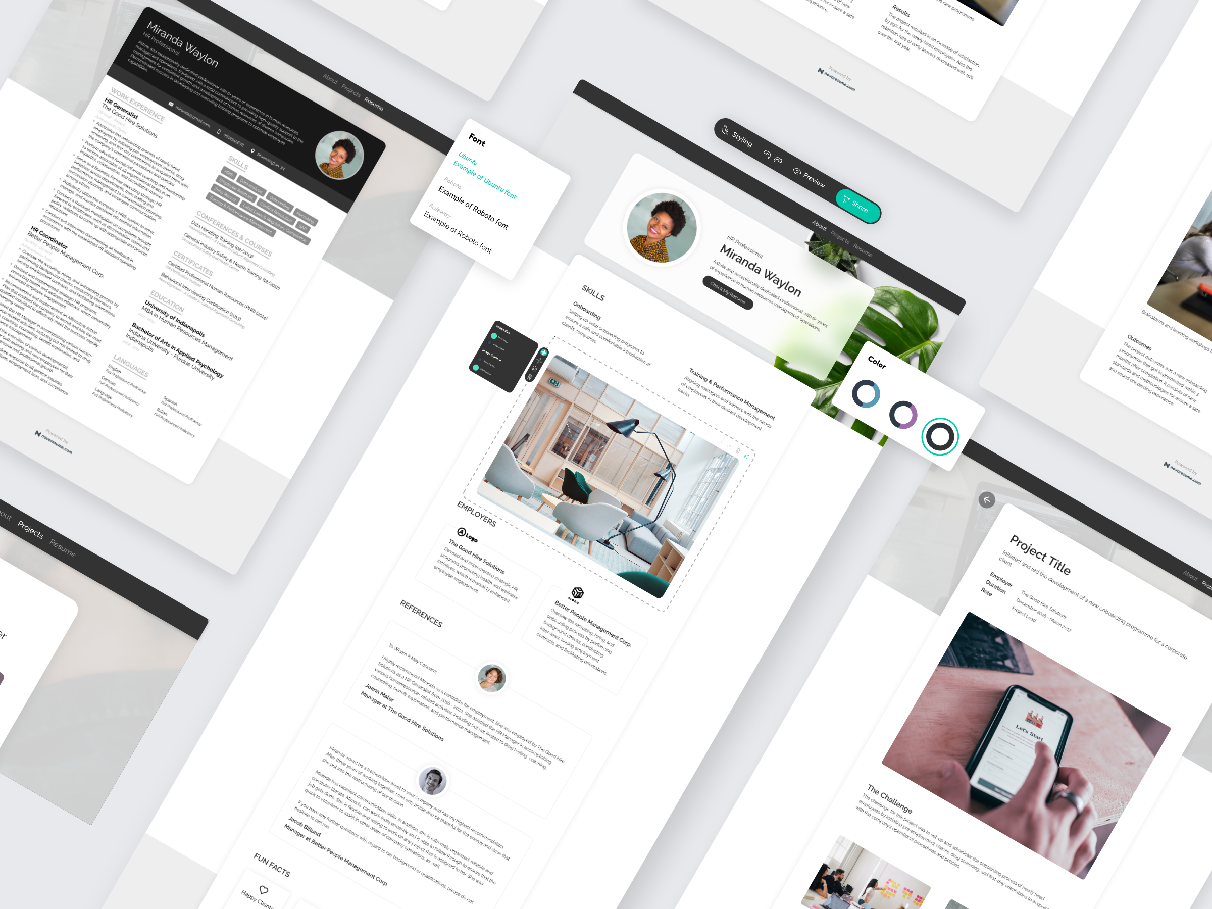
After the features were defined, it was my turn to make pixel-perfect designs for these features. The prototypes in the research phase were all made rapidly without a clear design language in mind, now was the time to mature the design language and approach it more systematically. As this would only be an MVP and not a fully finished product, there was no need for an elaborated design system yet; the focus was still on speed.
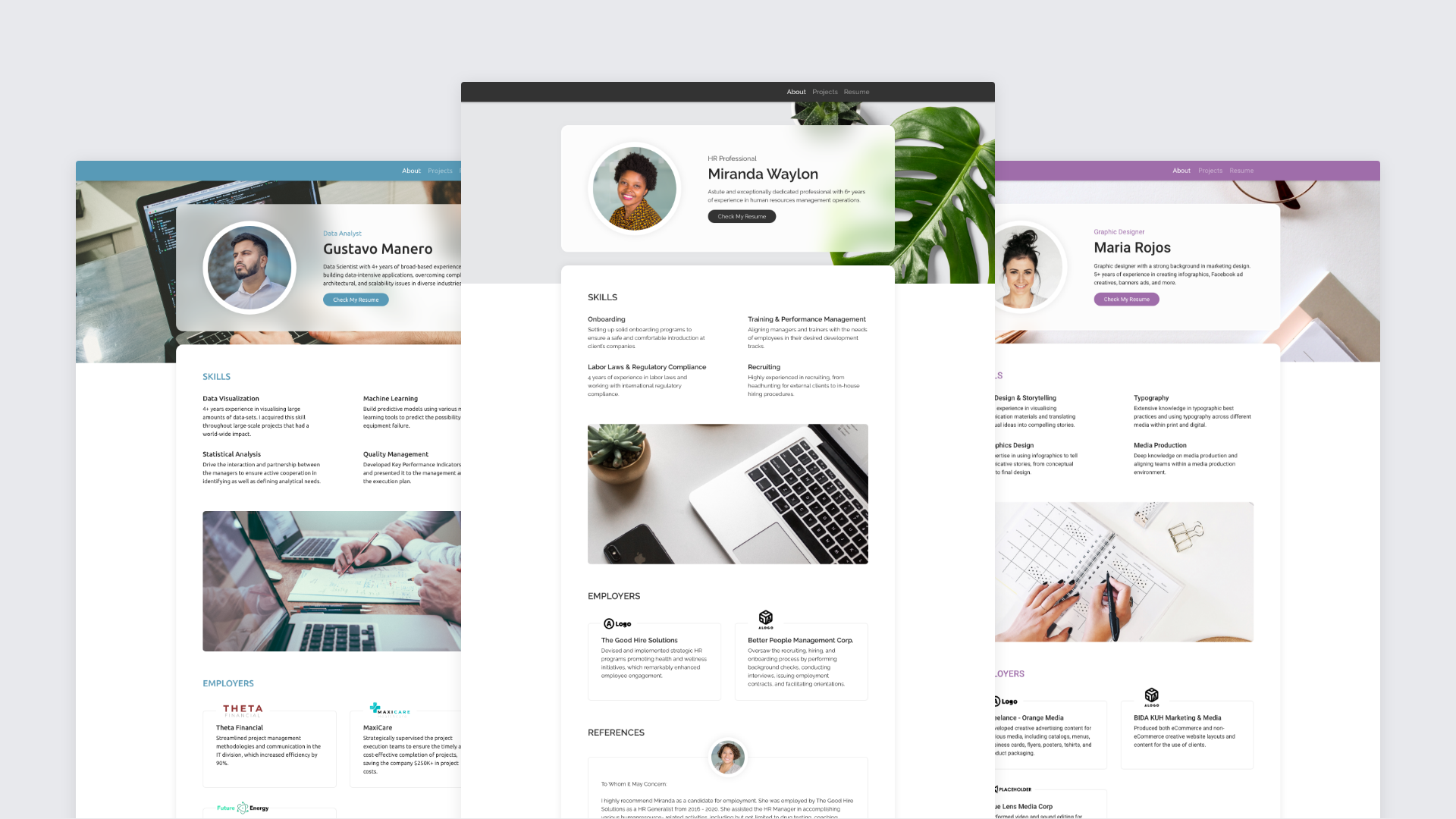
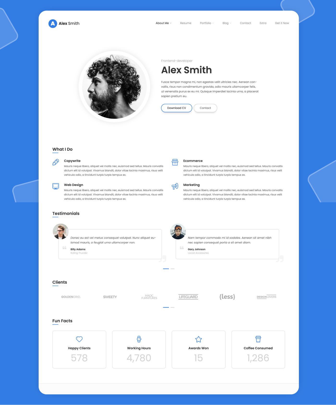
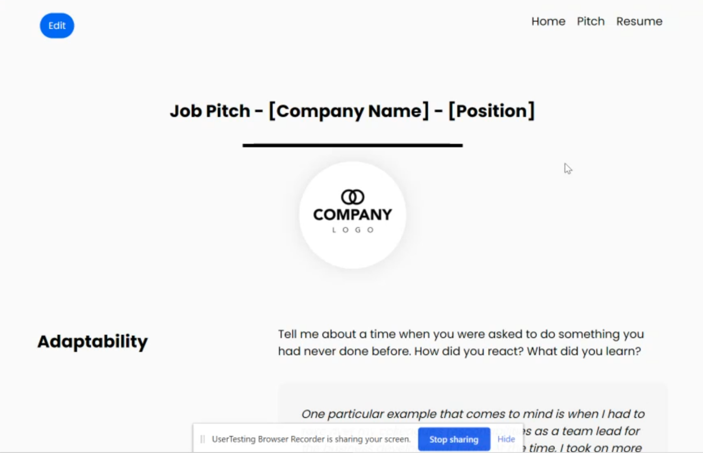
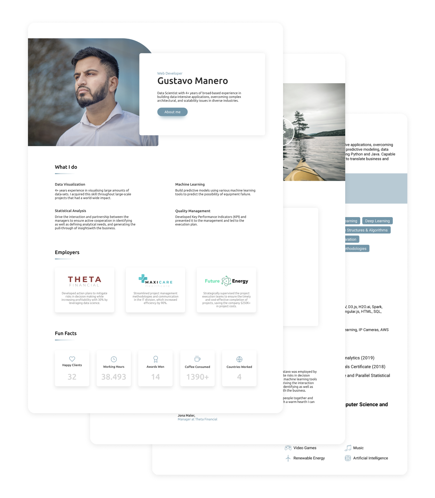
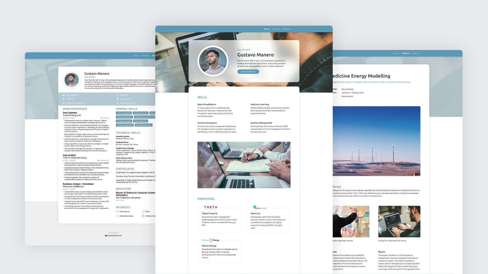
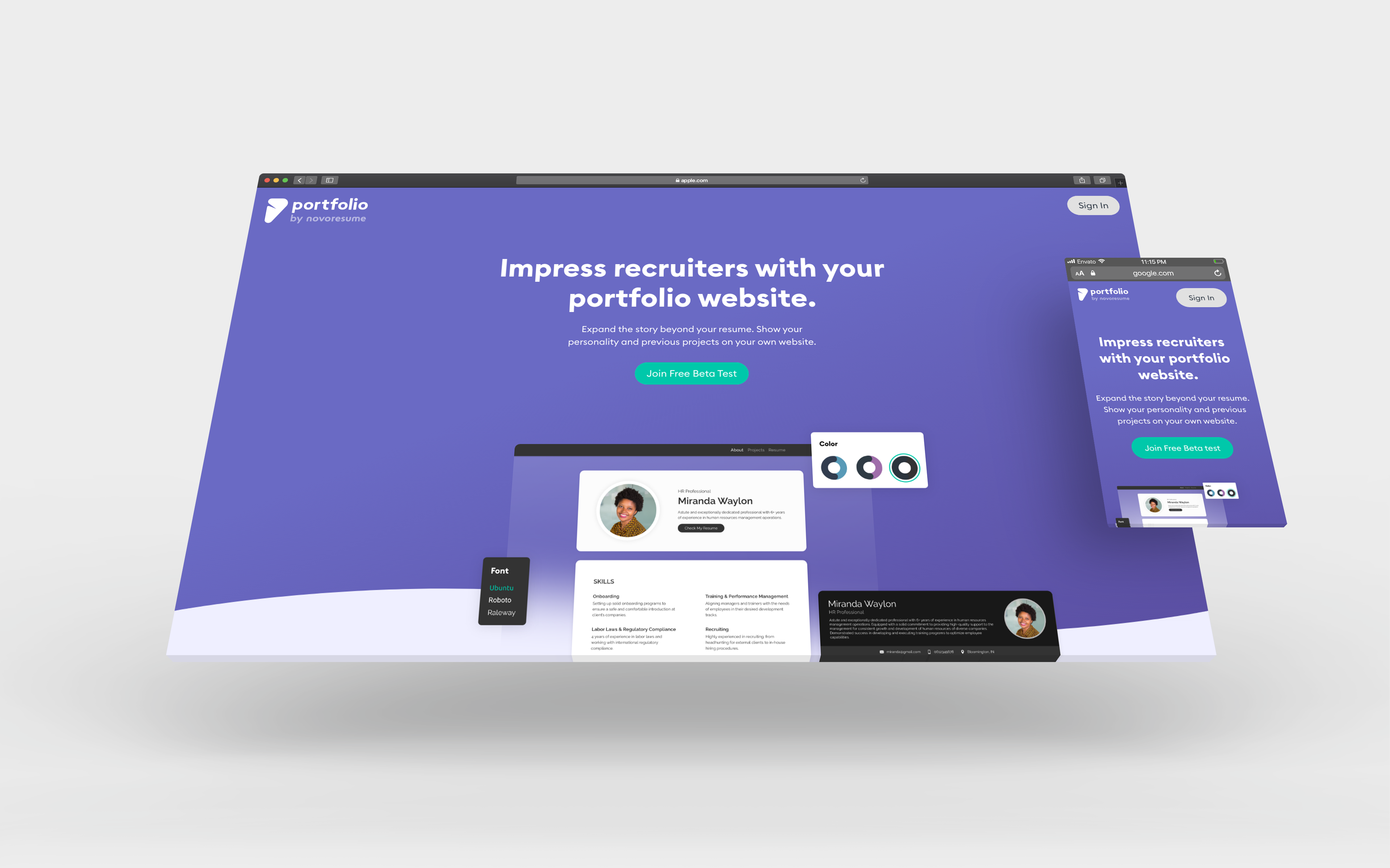
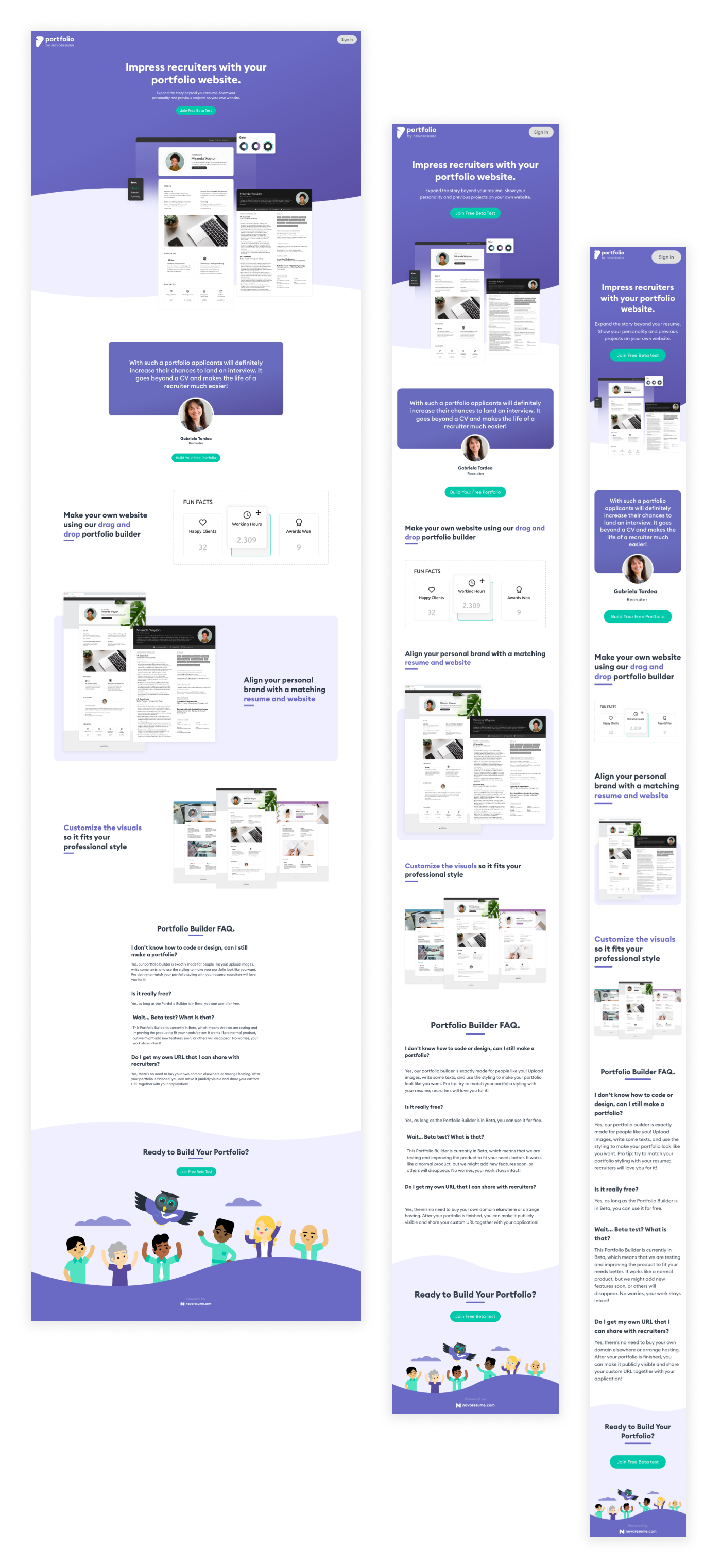
I’ve designed several portfolios that could be the outcome of what people can make with our builder. This was also done to have good visuals that make people enthusiastic about joining our MVP-Beta Test because we would need to recruit participants soon.
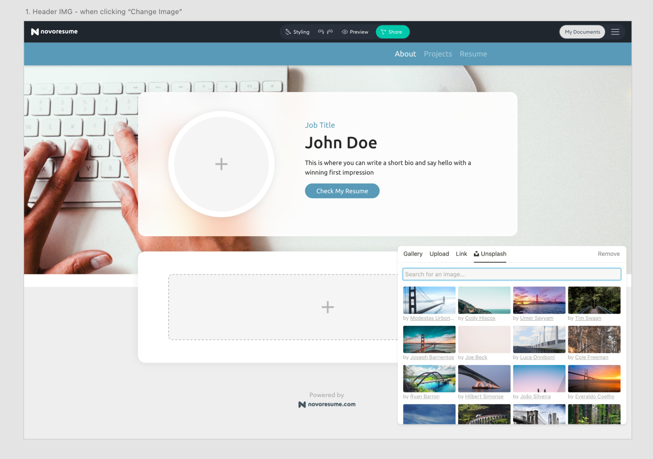
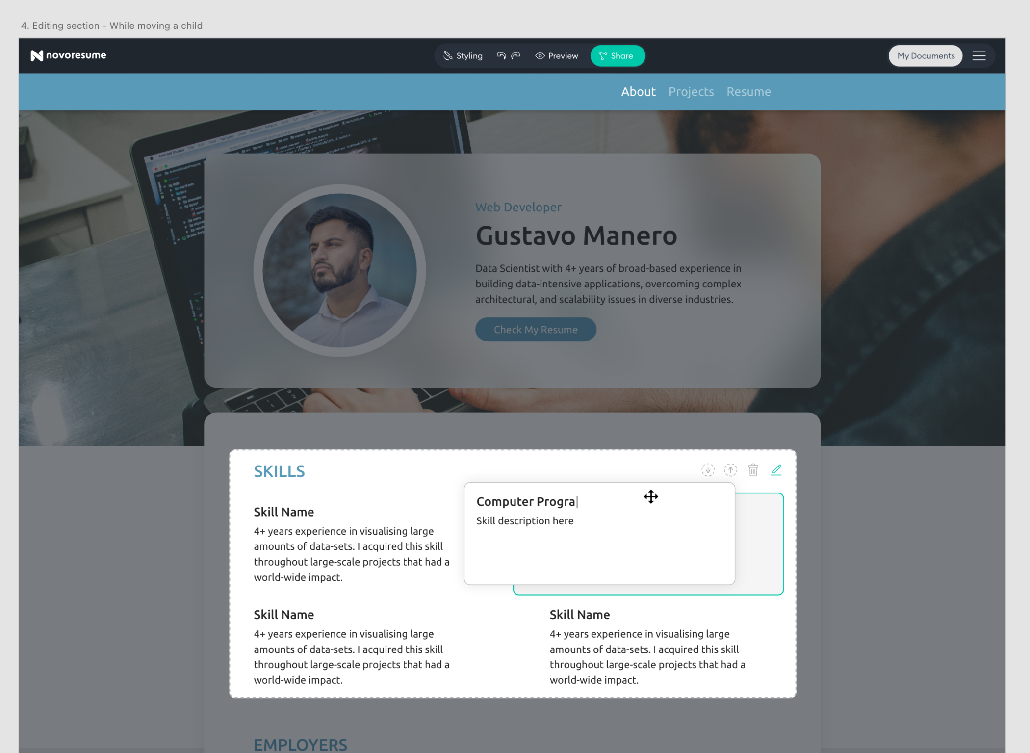
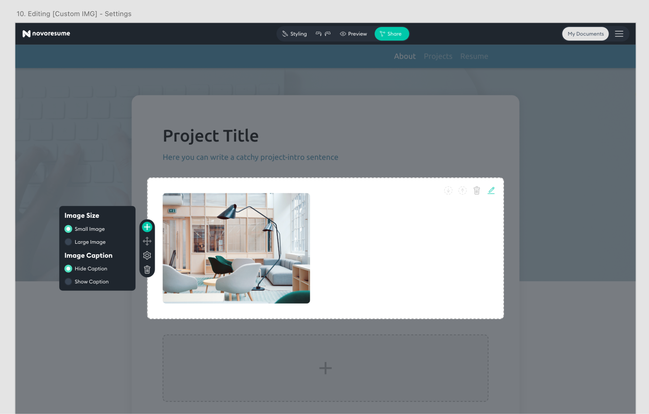
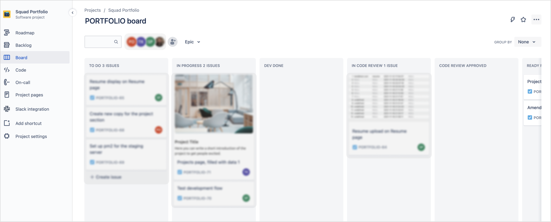
Next to the designs of the finished portfolio’s, we needed an interface through which users could edit and build their own portfolio. In order to save time, I used several existing components of our ‘Resume Editor’ but I also took the opportunity to explore some different ways of editing. The testing of the MVP could show that these new ways of editing are more useful and thus replicable to our other products in the company.
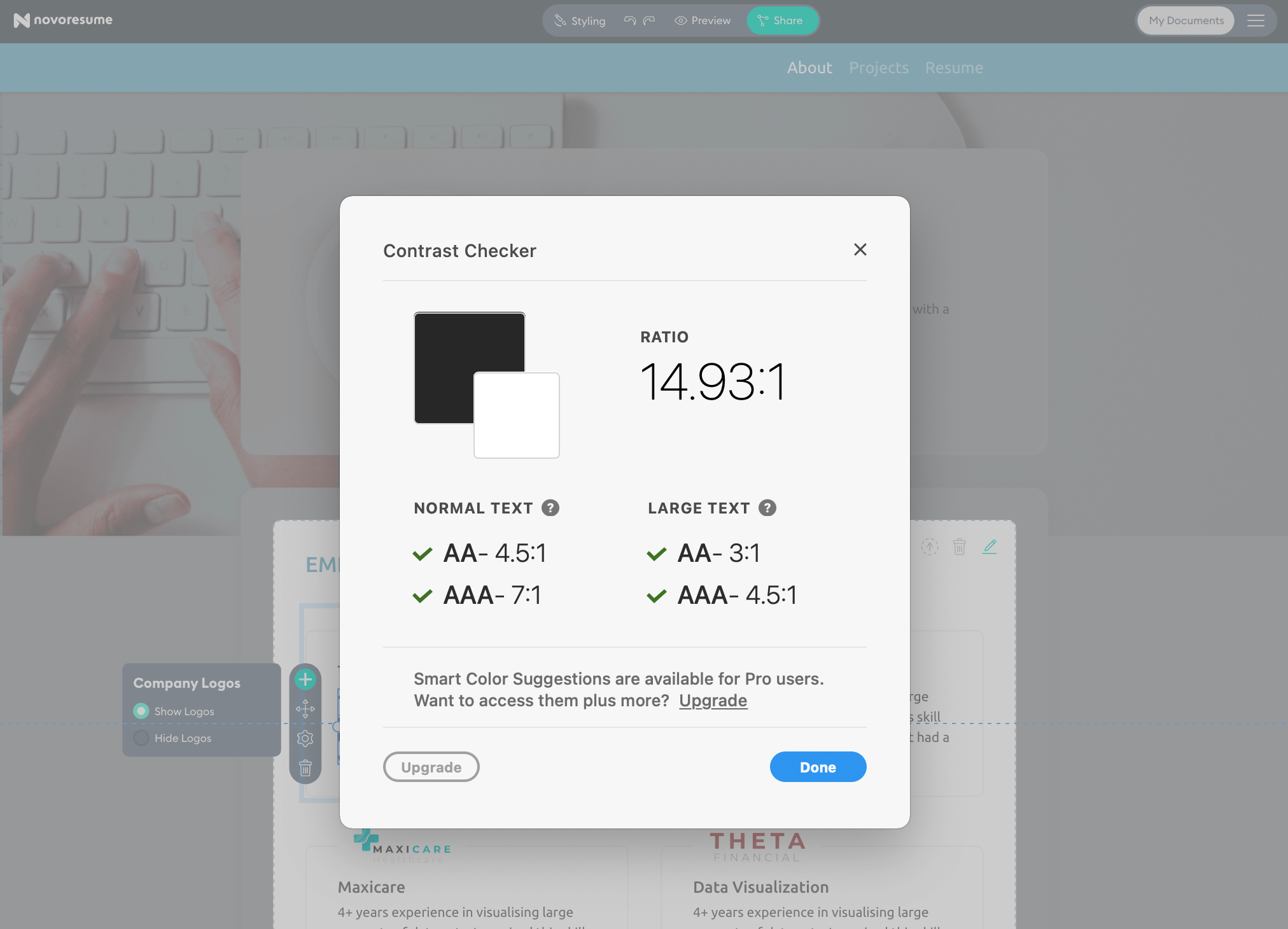
In order to increase the level of accessibility for this product, I’ve included a few design steps. Some are “thinking” steps, some are “good practices” and other are “testing steps”.
Once the UI Designs were finalized, it was up to the developer to make them come alive in code. This is a crucial step in the process; it’s very important that both parties are aligned and have the right tools to understand each other's work and try to make the other person’s life easier. We did this by having several handoff/feedback meetings to align on details, simplify complexity and tweak specific details. Zeplin was our ‘communication-bridge’ were the developer could inspect my designs and find all the details. As always, inevitable technical roadblocks emerged that we had to overcome by moving our ‘must haves’ and ‘nice to haves’ around.
The next step for testing this MVP was to make a landing page explaining this new ‘Portfolio Builder’. I’ve designed below web page to make potential users enthusiastic and have them sign up to try it out.


A selection of Service Design, UX and UI projects.


